My previous website looked pretty cool- but it wasn't my own work. I updated the website to use my own stylesheet and page layout!
This website will automatically adjust to your display width, so on large monitors the whole screen is filled (unlike my previous design), while the website is also perfectly visible on smaller screens (it still loads a special mobile version on mobile devices, so I don't have to worry about those). The navigation bar is in a location you barely see on the internet: on the right. I personally think it's a very logical position for such a bar. In the navigation itself, some games I personally recommend are now below the category they're from. This replaces the pop-out menus, which would feel incredibly odd paired with the small texts on the side bar. Lastly, the website now has a very simple and easy-on-the-eyes color scheme: very light-green with pure black text on top.
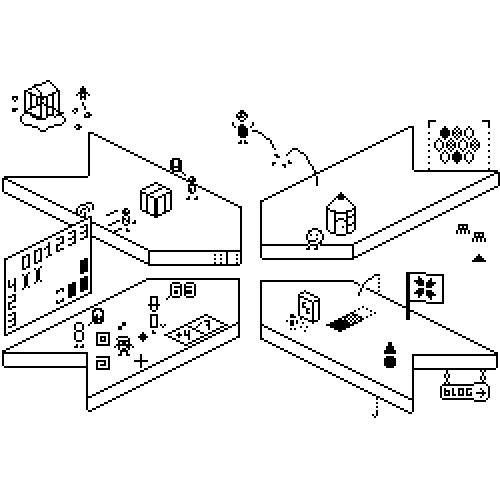
The home page also has been replaced with the image above this block of text. The image is an image map, with which you'll be able to access all games! Try it out here. I have not been able to make some changes to page structure (like giving each game it's own page, and making them accessible with a 'by year' sorting function) because it would cause links to break. That is also why this page is still called 'Home'. I will look into a solution to this later, but for now, I'm keeping it close to the old sites page hierarchy.
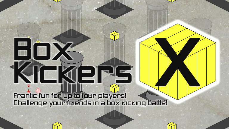
I have also taken the opportunity to add listings for Harry and his Herring, jumpNULL and Box Kickers X to the site. The websites maintenance was lagging behind, something I am trying to solve with this new design.
I hope this new designed website will hold up for the many years to come. And if it doesn't, I'll just have to make it more awesome. Happy gaming!
This website will automatically adjust to your display width, so on large monitors the whole screen is filled (unlike my previous design), while the website is also perfectly visible on smaller screens (it still loads a special mobile version on mobile devices, so I don't have to worry about those). The navigation bar is in a location you barely see on the internet: on the right. I personally think it's a very logical position for such a bar. In the navigation itself, some games I personally recommend are now below the category they're from. This replaces the pop-out menus, which would feel incredibly odd paired with the small texts on the side bar. Lastly, the website now has a very simple and easy-on-the-eyes color scheme: very light-green with pure black text on top.
The home page also has been replaced with the image above this block of text. The image is an image map, with which you'll be able to access all games! Try it out here. I have not been able to make some changes to page structure (like giving each game it's own page, and making them accessible with a 'by year' sorting function) because it would cause links to break. That is also why this page is still called 'Home'. I will look into a solution to this later, but for now, I'm keeping it close to the old sites page hierarchy.
I have also taken the opportunity to add listings for Harry and his Herring, jumpNULL and Box Kickers X to the site. The websites maintenance was lagging behind, something I am trying to solve with this new design.
I hope this new designed website will hold up for the many years to come. And if it doesn't, I'll just have to make it more awesome. Happy gaming!
 RSS Feed

